10 important URLs that every single Google user needs to know

Original Source: http://bgr.com/

Personally, I love that Google is so creative with my private data. I am fully aware that in order to use Google’s many great “free” services, I pay the company in information about myself that helps it serve better ads. That same information lets it create fantastic services such as Google Now, and it saves me a tremendous amount of pain and suffering. It also, of course, helps make Google Search better. But even if you’re like me and you’re happy with this model, it’s still very important to be fully aware of what Google collects and how you can control it.

With that in mind, here are 10 important URLs compiled recently by Digital Inspiration that every single Google user should be aware of.

https://accounts.google.com/SignUpWithoutGmail — Create a Google account with your current email address instead of making a new gmail.com address.

https://www.google.com/ads/preferences — View and edit your profile within Google’s system as it relates to advertising (you can also opt out of interest-based ads here).

https://www.google.com/takeout — Use this link to export all of your data contained within the Google ecosystem, including emails, photos and YouTube videos.

https://support.google.com/legal — This URL will let you file a complaint in the event you find your content being used without permission on a Google website.

https://maps.google.com/locationhistory — This is exactly what you think it is, your location history if you use an Android phone or the Google Now iOS app.

https://history.google.com — Your entire search history; make a pot of coffee before you start digging.

https://www.google.com/settings/account/inactive — If you have unused Gmail accounts, use this to ensure that Google doesn’t delete them after extended periods of inactivity.

https://security.google.com/settings/security/activity — Think someone might have gained unauthorized access to your account? This is your first stop.

https://security.google.com/settings/security/permissions — Here is a complete list of all Web, mobile and desktop apps that can access your data.

https://admin.google.com/YOURDOMAIN/VerifyAdminAccountPasswordReset — A link to reset your Google Apps password if your account is ever hacked (replace “YOURDOMAIN” with your URL, including the top-level domain).

Advanced Business Card Designs

The design industry is an ever changing ecosystem of innovative and creative ideas. In an environment that is so constantly in flux its essential to stand out. At Elemental Studios we understand that first impressions are critical and the need to make an impact as soon as you meet a new potential client is extremely important. The first thing we tend to provide a new interested clients is our business cards, so why hand then something everyone else has? Just as the graphic design industry evolves so does the printing industry. Today you can find printing techniques that were unavailable prior or just extremely expensive.

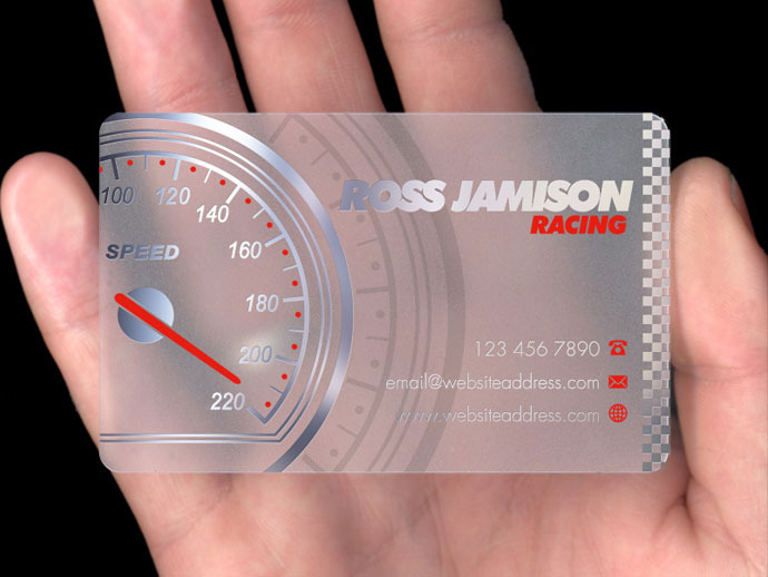
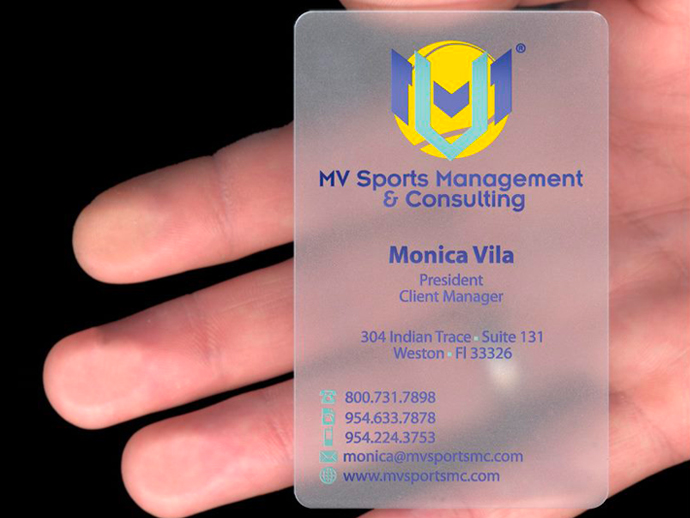
Our design team is seasoned in creating options that incorporate the latest in printing techniques, such as Clear (Acrylic) Business Cards:  (Some images provided by www.plasmadesign.co.uk)

396161_10151283155878585_1928420836_n


17


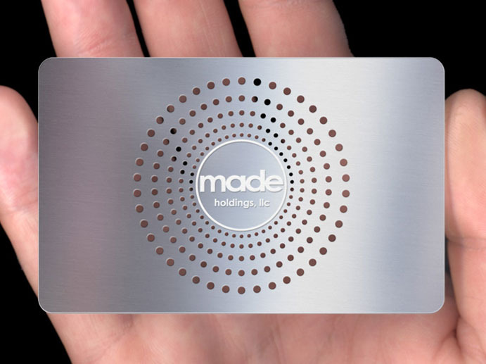
Or how about these metal cards: (Some images provided by www.plasmadesign.co.uk)

31

26


Other incredible new printing options include wooden cards, leather cards, turf cards (Actual TURF!) and various other unique materials. Call our studio today and speak with a design coordinator to find out what options would be best for your business and start creating and impact today.


Design Around the Lines: Barcodes Don’t Have to Be Boring

MONDAY 12.23.2013 , POSTED BY 

We love the idea of taking overlooked design elements and making them beautiful. The barcode is a good example of this. It’s on nearly everything we buy – from your latest iPad purchase to a Snickers bar at the market – just a bunch of lines and numbers with very little (if any) thought put in to how it looks. We’ve covered Steve Simpson’s remixes before, and now we’ve run across D-Barcode, a Japanese design firm that’s been steadily revamping this oft overlooked element.

SEE ALSO STEVE SIMPSON REMIXES THE UBIQUITOUS BARCODE

The thing about barcodes is this: you only need a very small area to actually read the information. What surrounds this small patch of data, is hardly important and ripe for creative artwork that plays upon the barcodes linear form. D-Barcode has turned those strips of black into streaks of falling rain, a placemat on the table, the walls of a fairytale castle, and even a cascading waterfall. As you can probably tell, the numbers are only there for visual input should the barcode become unreadable – so those elements can easily be moved or even have the font changed. We’d love to see this on more products – at least it would add something interesting to look at when eating our breakfast cereal. Be sure to check out more at D-Barcode, and see Steve Simpson’s guidelines for how to design your own.

D-barcode japanese creative barcodes 1

D-barcode japanese creative barcodes 2

D-barcode japanese creative barcodes 3

D-barcode japanese creative barcodes 5

D-barcode japanese creative barcodes 6

D-barcode japanese creative barcodes 7

D-barcode japanese creative barcodes 8

D-barcode japanese creative barcodes 9

D-barcode japanese creative barcodes 10

D-barcode japanese creative barcodes 11

D-barcode japanese creative barcodes 12

D-barcode japanese creative barcodes 13

A Map of Who’s Got the Best (And Worst) Internet Connections in America

A Map of Who’s Got the Best (And Worst) Internet Connections in America

In the digital age, access to high speed internet is fundamentally important. But some regions of the country are still left out in the cold. We took a look at where you can get the best—and not best—internet in the U.S.

In an interview this February, Susan Crawford–former special assistant to President Obama for science, technology and innovation–summed up the state of America’s slow, expensive internet thusly:

The rich are getting gouged, the poor are very often left out, and this means that we’re creating, yet again, two Americas, and deepening inequality through this communications inequality.

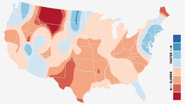
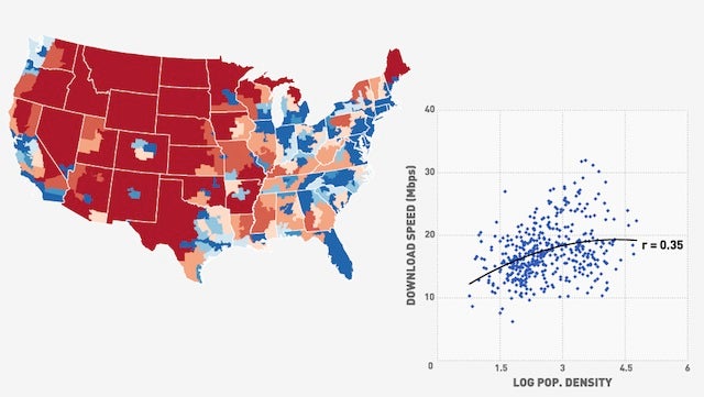
Where can we find these two Americas? The map above shows relative download speeds (by congressional district*) across the contiguous U.S., based on January through July data from over 5,600 cities and towns represented in Ookla’s Net Index. Blue means a faster download speed than the national average of 18.2 Mbps, while red means a slower download speed.

18.2 Mbps isn’t shabby, and it’s a lot faster than where some other sources put U.S. internet speeds. This is because Ookla’s data are primarily coming from the site Speedtest.net, which is self-selectively used by people who’d actually bother to check their download speeds. On one hand, this means that the raw Mbps figures are heavily skewed towards high-speed users. On the other hand, it means that the relative comparison between regions is a lot more interesting – instead of simply mapping out what parts of the country haven’t fully switched away from dial-up, this is showing, for users who are at least somewhat internet-savvy, where good speeds are generally available.

Basically, these data show where getting a fast internet connection is even possible.

The Fastest and Slowest

The fastest single location, with an average download speed of 85.5 Mbps belongs to Ephrata, Wash., a small town of 7,000 that happens to be home to its own fiber optics provider. Google’s grand experiment in Kansas City, Kan. comes in second, clocking in at 49.9 Mbps. The worst speeds can be found in Northeastern Arizona, where Chinle and Fort Defiance both clock in at less than 1.5 Mbps. For a complete list of cities and towns by speed click here, or check them out on the map below.

Extended Borders

The kernel density map below smooths this data out a bit, with each pixel colored by the average internet speed, relative to 18.2 Mbps, within a surrounding 200-mile radius (weighted by distance). The metropolitan Northeast, Florida, and most of Arizona come in pretty strong, while the enormous internet hole called Montana is pinned between the techy Northwest and the suddenly oil-rich North Dakota.

A Map of Who's Got the Best (And Worst) Internet Connections in America

Income vs. Speed

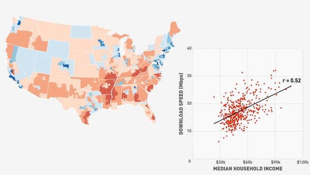
As to Browning’s point, this “communications inequality” probably has a lot more to do with income than it does with pure geography. The map below, on the same relative-to-the-national-average scale, shows median income by congressional district based on 2011 American Community Survey Census data, which we then correlated with download speed. No surprises here, the more money you live around, the faster speeds you have access to.

A Map of Who's Got the Best (And Worst) Internet Connections in America

Population Density vs. Speed

Population density may have a less linear effect – while rural areas are less likely to get high-speed coverage, dense cities may see that coverage slowed by heavy use. Density by congressional district is plotted below, but the correlation (polynomial, based on our hypothesis) wasn’t as strong as income.

A Map of Who's Got the Best (And Worst) Internet Connections in America

In an economy that is increasingly internet-driven, speed matters. It’s nice to think that Google will eventually fiber-up the U.S. out of the goodness of its heart, but until useful internet is recognized as an essential public good– like highways, or electricity –the rich will just keep getting richer.

*Congressional districts may seem like an odd choice, but it’s the only census-linked, nationally comprehensive geography that fills the awkward gap in grain between states (50) and counties (3,144).