A Map of Who’s Got the Best (And Worst) Internet Connections in America
A Map of Who’s Got the Best (And Worst) Internet Connections in America
In the digital age, access to high speed internet is fundamentally important. But some regions of the country are still left out in the cold. We took a look at where you can get the best—and not best—internet in the U.S.
In an interview this February, Susan Crawford–former special assistant to President Obama for science, technology and innovation–summed up the state of America’s slow, expensive internet thusly:
The rich are getting gouged, the poor are very often left out, and this means that we’re creating, yet again, two Americas, and deepening inequality through this communications inequality.
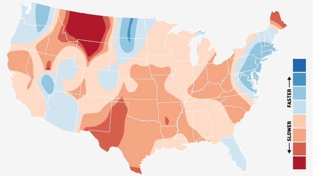
Where can we find these two Americas? The map above shows relative download speeds (by congressional district*) across the contiguous U.S., based on January through July data from over 5,600 cities and towns represented in Ookla’s Net Index. Blue means a faster download speed than the national average of 18.2 Mbps, while red means a slower download speed.
18.2 Mbps isn’t shabby, and it’s a lot faster than where some other sources put U.S. internet speeds. This is because Ookla’s data are primarily coming from the site Speedtest.net, which is self-selectively used by people who’d actually bother to check their download speeds. On one hand, this means that the raw Mbps figures are heavily skewed towards high-speed users. On the other hand, it means that the relative comparison between regions is a lot more interesting – instead of simply mapping out what parts of the country haven’t fully switched away from dial-up, this is showing, for users who are at least somewhat internet-savvy, where good speeds are generally available.
Basically, these data show where getting a fast internet connection is even possible.
The Fastest and Slowest
The fastest single location, with an average download speed of 85.5 Mbps belongs to Ephrata, Wash., a small town of 7,000 that happens to be home to its own fiber optics provider. Google’s grand experiment in Kansas City, Kan. comes in second, clocking in at 49.9 Mbps. The worst speeds can be found in Northeastern Arizona, where Chinle and Fort Defiance both clock in at less than 1.5 Mbps. For a complete list of cities and towns by speed click here, or check them out on the map below.
Extended Borders
The kernel density map below smooths this data out a bit, with each pixel colored by the average internet speed, relative to 18.2 Mbps, within a surrounding 200-mile radius (weighted by distance). The metropolitan Northeast, Florida, and most of Arizona come in pretty strong, while the enormous internet hole called Montana is pinned between the techy Northwest and the suddenly oil-rich North Dakota.
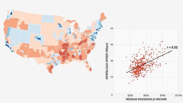
Income vs. Speed
As to Browning’s point, this “communications inequality” probably has a lot more to do with income than it does with pure geography. The map below, on the same relative-to-the-national-average scale, shows median income by congressional district based on 2011 American Community Survey Census data, which we then correlated with download speed. No surprises here, the more money you live around, the faster speeds you have access to.
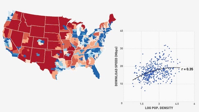
Population Density vs. Speed
Population density may have a less linear effect – while rural areas are less likely to get high-speed coverage, dense cities may see that coverage slowed by heavy use. Density by congressional district is plotted below, but the correlation (polynomial, based on our hypothesis) wasn’t as strong as income.
In an economy that is increasingly internet-driven, speed matters. It’s nice to think that Google will eventually fiber-up the U.S. out of the goodness of its heart, but until useful internet is recognized as an essential public good– like highways, or electricity –the rich will just keep getting richer.
*Congressional districts may seem like an odd choice, but it’s the only census-linked, nationally comprehensive geography that fills the awkward gap in grain between states (50) and counties (3,144).