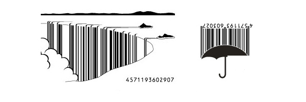
Design Around the Lines: Barcodes Don’t Have to Be Boring
MONDAY 12.23.2013 , POSTED BY BENJAMIN STARR
We love the idea of taking overlooked design elements and making them beautiful. The barcode is a good example of this. It’s on nearly everything we buy – from your latest iPad purchase to a Snickers bar at the market – just a bunch of lines and numbers with very little (if any) thought put in to how it looks. We’ve covered Steve Simpson’s remixes before, and now we’ve run across D-Barcode, a Japanese design firm that’s been steadily revamping this oft overlooked element.
SEE ALSO STEVE SIMPSON REMIXES THE UBIQUITOUS BARCODE
The thing about barcodes is this: you only need a very small area to actually read the information. What surrounds this small patch of data, is hardly important and ripe for creative artwork that plays upon the barcodes linear form. D-Barcode has turned those strips of black into streaks of falling rain, a placemat on the table, the walls of a fairytale castle, and even a cascading waterfall. As you can probably tell, the numbers are only there for visual input should the barcode become unreadable – so those elements can easily be moved or even have the font changed. We’d love to see this on more products – at least it would add something interesting to look at when eating our breakfast cereal. Be sure to check out more at D-Barcode, and see Steve Simpson’s guidelines for how to design your own.


Leave a Reply
Want to join the discussion?Feel free to contribute!