Have you “Built your Brand” properly?
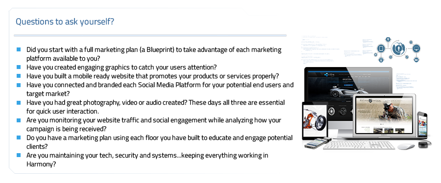
/0 Comments/in Business, Graphic Design/by Bruce QuirozHere at Elemental Studios we often compare building your brand to modeling the architecture of a building’s infrastructure. Everything depends on a well thought out blueprint, a strong foundation and the ability to build each facet of your marketing in harmony with your businesses growth. In essence…. Proper Planning Prevents Poor Performance
So you’ve just finished building a new website….and now you’re expecting the phones to start ringing, for your internet sales to skyrocket and your shipping and fulfillment center to have trouble keeping up… right?
Yes, you just read that correctly…. HOLY TECHNICAL CRAZINESS! While it seems as though there is no possible way you could stand out in such an ever expanding technical ecosystem, we want to assure you that YOU CAN!
By taking advantage of our “Design and Architectural Marketing Model,” Elemental Studios, Inc. can guide you through how to make the most of your marketing through Brand Recognition, Online and Social Platform Development, Video and Analytics, and lastly with our ongoing maintenance and marketing solutions.
We are not just a design firm, we are a Team of Artist, Engineers, Musicians and Dreamers who love what we do and can’t wait to work with you…
“Redesigning and /or Remarketing Your Brand – How & When is it Time?”
/0 Comments/in Business, Frontpage Article, Graphic Design/by Bruce QuirozSooner or later the time comes when your corporate identity and/or marketing scheme are no longer up to scratch. With tax season in the rear view mirror (hopefully) and summer heating up, redesigning and marketing your corporate identity may seem like only an afterthought.
However, could it be time to take that great leap?
On average, businesses change their identities once every seven to ten years and, depending on the platform, remarket yearly. The important factors to consider when assessing this includes equity measurement; market differentiation and accessibility; brand awareness, relevance and vitality; and consumer personality, preference, usage, associations, and emotional connectivity.
If your company can improve its relationship to its customer base in any or all of these key areas, you may want to think seriously about making the move. Here are five reasons to invest in our re-branding and multi-platform marketing endeavors:
1. You’re ready for a change – it’s time to revitalize your image.
2. Your brand’s image/marketing scheme no longer reflects who you are or what you do.
3. Your corporate aptitudes have increased with key changes in business
strategy/leadership/geography.
4. Your competition is expanding and their volume is deafening.
5. It’s time to evolve with ever-changing social media platforms
Next Up: “SEO 101: How, What & When”
#ES2015
11 ways to stop clients asking for endless revisions
/0 Comments/in Business, Graphic Design, Psychology/by Bruce QuirozArticle by: http://www.creativebloq.com/
What do you do when clients won’t stop asking for revisions? Egle Karalyte, founder of My Visual Brief, has some advice.
As a designer, you’ve probably had the experience of working with a client who repeatedly asks for revisions with no end in sight. It’s frustrating, right?
You want to keep the client happy without driving yourself crazy or ruining your profit margin. Both are essential to the success of your business. So it’s important to understand how to avoid getting sucked into the vicious cycle of revisions.
Delicate matter
Managing projects and client relationships is a delicate matter and a two-way street. Sometimes we just end up working with an over controlling client who’d do everything themselves “if only I knew Photoshop”. But at other times we haven’t set the right expectations with the client from the beginning, or we’ve mismanaged the client relationship.
Since starting InfinVision, a design agency, in 2008 and recently developing My Visual Brief, a design briefing tool, we’ve experimented with many different ways of managing client relationships.
Every client is unique and we always factor in the option of making adjustments. But in general, the following strategies have helped us create healthy professional relationships with our clients.
01. Start with the intention to develop a healthy relationship with your client

If you start the project just wanting to finish it quickly and get paid ASAP, then you’re setting yourself up for failure.
An unreasonably short timeframe will create stress and anxiety that will cause you to be frustrated about each additional client request, no matter how minor. Also, the client will feel that you’re in a rush and not intending to give your best. If they feel like they are getting short-changed, they’ll likely start asking for more, more, more. Such a professional relationship is doomed to constant friction and will likely end badly.
However, if you start a project with the mindset of developing a healthy relationship with your client and doing your best, you’ll be off to a good start. Aim for a mutually beneficial professional collaboration where you respect each other’s time and ideas. From here, any hiccups along the way will be easier to resolve.
02. Educate your client about the real purpose of a revision

The design process naturally consists of phases. The designer creates a design draft and asks the client for feedback. Revisions are then made with the goal to move closer to the best end result for the client’s project and its audience.
In other words, revisions are part of the design process and they cannot (and should not) be avoided. Rather, they should be done purposefully by keeping in mind the project’s objectives.
In your first meeting with a new client, explain this process as part of your overall work approach. You’ll set up certain expectations – of both your role and their role. That will give them a clear perspective on how the project will unfold and they’ll understand that revisions are part of the process.
Knowing these boundaries, they should respect the process (you might need to remind them a few times along the way) and not take advantage of you by asking for numerous revisions based on their whims. Unfortunately that does happen. Read on to find out what to do when it does.
03. Clearly define and articulate what is a round of revision

Your client hired you because you’re the professional, not them. They may not know exactly what constitutes a “round of revision” – it can be a vague term for someone not familiar with design jargon. Take the time to explain to your client exactly what a round of revision is and include the specifics in your initial estimate and legal contract.
Here’s how we at InfiniVision define a round of revision for our clients. Once a design draft is presented, the client has a specified number of days to provide their feedback. Once all of their comments, ideas and questions are consolidated and we provide a new version, that’s the end of that round of revision.
Professional tip
Don’t jump into doing a revision right after the client has provided their initial comments. Often people have an immediate reaction that changes after thinking about and reviewing the project over time.
Give a client enough space to formulate all of their thoughts into a cohesive response, then review and confirm the changes they’re requesting. Then and only then, get back to work on it.
Following these clear steps in a round of revisions will structure and pace the project in a way that’s comfortable for the client and less stressful for you.
04. Clearly define how many rounds of revisions are included in your fee

The number of rounds of revisions – based on your professional knowledge of the complexity of the project – should be clearly articulated both in your legal contract and in the initial estimate you send to the client.
The more transparent and informative you are upfront, the less confused your client will be. In the end, your diligence at the beginning will prevent misunderstandings and conflicts throughout the remainder of the process.
05. Clearly define when change requests will be considered extra work and how this will be billed

As you know, there are major revisions and minor ones. But your client might not realize there’s a difference. Give your client clear examples of each so they understand it upfront. For instance, you could say: “Moving photos and text around the page means we are doing layout changes and that’s a major revision. However, changing a short text phrase here and there is a minor revision.”
Again, these specifics (including how you bill for major revisions – eg hourly rate or flat fee) should be included in both your legal contract and the initial estimate you send to your client.
Of course, you can’t include every possible scenario in these documents, and many change requests are somewhere in the middle between major and minor. It’s your job to keep educating the client along the way and referring back to the initial examples you provided at the beginning.
06. Keep the client informed about each phase of the design process

Most clients aren’t aware of the incremental steps a design process entails. Keeping the client informed about each design phase helps prevent misunderstandings about where you are in the overall process.
For example, after we receive the client’s first consolidated feedback we send them a confirmation email. We’ll use a subject line such as “first round of revisions out of three” and then reiterate the changes we’re planning to do based on their feedback.
Taking time to do this will help you structure your work and manage the revisions, but most importantly, it will keep the client informed about the progress of the project.
07. Don’t forget to show your goodwill and flexibility

Most clients are nervous about choosing the right designer, one who will be committed to the project and do their best to deliver quality work. If the client doesn’t really trust you, the project will not run smoothly.
It’s your job to establish trust and show the client you are coming into the arrangement in a spirit of goodwill. If you push too hard on that extra chargeable time, the client will feel that your primary concern is earning money rather than addressing their needs. So be careful.
Moreover, it could be in your best interest to do a little bit of extra non-billed work here and there because goodwill goes a long way. It helps to strengthen a relationship with a client and reinforce that trust.
A word of warning: only do this if you don’t feel resentful about it. Make it your choice, not something your client expects from you. If they begin to take advantage of your generosity, refer back to your initial contract and estimate. They’ll respect you for sticking up for yourself!
08. Accept that design is subjective

Sometimes you and your client won’t agree about the best design solution. Or, your client might reject your ideas simply because it doesn’t appeal to them. It can be useless to argue when it’s a matter of personal taste; you might need to just spend that extra time making more revisions.
Although this might be disappointing to you as a designer, simply accept that design is subjective and you, as a designer, are providing a professional service to the client. Thus, plan for this possibility when initially budgeting out your project. For example, depending on how clear a project is, we put a 10-20 per cent ‘contingency’ on top of the actual project time to accommodate this unknown factor. This way we protect our time and avoid any frustrations.
Ideally, you would avoid such a major design overhaul by being on the same design page as your client from the start. An easy way to do this is by using a visual briefing tool such as My Visual Brief. You create a virtual design board – including colors, fonts, styles – for your client to look at and approve instead of relying merely on verbal descriptions. It’s our go-to method for eliminating aesthetic misunderstandings upfront.
09. Accept your mistakes

Design is subjective. Therefore, sometimes we, as designers, truly misunderstand what the client is expecting. Using words to communicate visual tastes and preferences can be tricky and misleading. If your design doesn’t meet the client’s expectations, simply apologize and ensure them that you’ll get it right. And, don’t count that round as part of the agreed number of revisions (sorry).
It can be a hard and costly lesson, but it happens to the best of us. After years of experience, we know that a project succeeds or fails based on how much care and attention we give to the design briefing process. It’s a crucial step that can save hours and heartache down the line.
So, be sure to ask your client the right questions to obtain all of the information you need. Then, use a visual tool, such as My Visual Brief, to visualize and communicate what the client wants and expects. If you catch discrepancies up front and adjust them, the rest of your project will flow smoothly.
10. Put a stop when needed

Sometimes enough is enough. If a client isn’t complying with what they agreed to in your estimate and contract, you’ll need to start protecting your boundaries or else risk getting taken for a ride.
As long as you have clearly communicated to the client upfront how you manage the revisions, you have a basis for calling a stop to their endless revisions.
Confidently (and pleasantly) say to your client something like this: “Since your request comes after we’ve completed the agreed upon rounds of revisions, I will have to charge you for this.” Short and simple.
11. Don’t waste your time with the wrong clients

That being said, sometimes no matter what you do, a client relationship just doesn’t work. Either the client has a different vision than you can provide, or they’re over-controlling, micro-managing or disrespectful. If they’re behavior is spoiling the synergy, you won’t be able to do your best work.
Just like in number 01 above – doing a project quickly just for the money – if you stay in a disagreeable or unfair client situation just because you need the cash, you’ll likely end up miserable. This can be soul-crushing to any creative person, and it’s not worth compromising your integrity. It’s better to use your time and ingenuity to look for someone who respects your talent and unique creative contribution.
We recommend ending an unpleasant client relationship sooner rather than later, for everyone’s sake. It might be scary and uncomfortable when you approach them, but it’s liberating once you do it.
Just be professional and try to keep your emotions or hurt feelings out of it. Use phrases like “creative differences” and “diverging aesthetic choices” (avoid “bad taste” and “can’t make up your mind”). If you retain your integrity, you will exit feeling like a professional, and you might teach your client a valuable lesson as well.
Conclusions
Managing client relationships is a delicate matter with many nuances. The strategies above have helped us refine our client communications and develop positive relationships that are crucial to our business success. Now it’s up to you to take these ideas and develop your own formula for creating healthy relationships with your clients.
Remember the keys: set expectations upfront, keep the client informed about each phase of the project, put a stop to revisions by referencing your initial agreement, stay flexible and show your good will.
Your ultimate goal should be to do your best within your capabilities, ensure the client is happy and create a piece of work you’ll be proud to include in your portfolio. The rounds of revisions should be only part of the framework that helps you to do your job well, rather than the sole focus of your work. The right clients will understand this and will appreciate the way you handle your professional relationships.
The best projects are when the issue of too many revisions doesn’t even come up. It means you’ve clicked with your client, there’s mutual trust and things are going smoothly. That’s what I’d like to wish for you: happy clients and fulfilling projects!
Adobe Partnership Could Be a Game Changer for Microsoft’s Surface Pro 3
/0 Comments/in Business, Frontpage Article, Graphic Design, Internet News/by Bruce Quiroz
Though the two have worked closely together in the past, it wasn’t until Microsoft CEO Satya Nadella took the stage with Adobe CEO Shantanu Narayen during Monday’s keynote presentation at Adobe’s Max conference, that it was clear the two companies have a closer partnership than ever, which may signal big changes for Microsoft’s Surface platform.
That the two would want to work together closely is not a surprise. Microsoft’s Surface Pro 3 has much more advanced software capabilities than iPads an other tablets — ideal for resource hungry applications like Photoshop and Illustrator.
On the software side, Adobe rolled out a new version of Illustrator optimized for the Surface Pro 3. “This touch workspace lets designers create on the go what they could once only accomplish sitting at their studio workbench before,” wrote Panos Panay, Microsoft’s corporate vice president for Surface in a blog post. “This new workspace exposes the core tools and controls for drawing and editing, making it super simple to start creating with pen and touch.”
The two companies also showed off Project Animal, a new animation app that has Kinect-like face and speech recognition and gesture tracking capabilities. Adobe executives hinted that users can expect more software like Animal in the future.
“Given the incredible technology they have across some of things they’re doing with Kinect and depth cameras and all the technology they’ve been working with from Xbox… that’s right there for us to work together on a collaborative basis ahead of where the creative community is right now,” said David Wadhwani, Adobe’s senior vice president and general manger of digital media.
Adobe also previewed a new touch workspace in Photoshop on the Surface Pro 3, nicknamed “Playground.” Playground has all the power of Photoshop on the desktop, says Adobe, but a completely redesigned, touch-enabled, user interface.

IMAGE: ADOBE
One Playground feature, Layer Inspector, allows users to navigate between layers by swiping across them on their screen. The layers can also be picked up and rearranged solely with touch gestures.
“The thing when we created Surface Pro 3 was to get touch and keyboard and mouse to be seamless and natural as a way to enhance productivity,” Nadella said during the demo.
If that sounds familiar it’s because it sounds a lot like Microsoft’s Continuum feature in the newly unveiled Windows 10.
If that sounds familiar it’s because it sounds a lot like Microsoft’s Continuum feature in the newly unveiled Windows 10. Continuum allows users to easily switch between tablet (touch) mode and “mouse and keyboard” mode when using hybrid two in one devices, like the Surface Pro.It’s not completely clear what the partnership between the two companies means for now— Nadella described it as having “new energy,” but didn’t elaborate on specifics. And Adobe is by no means shifting away from Apple (many of Adobe’s mobile apps are still iOS only.) But both CEOs made it clear they were committed to working together on innovative creativity applications.
To further drive that point, Nadella announced Microsoft was giving every Max attendee a Surface Pro 3. This may not seem particularly significant in itself— Microsoft gave an Xbox One to everyone at its Build Developer Conferenceearlier this year, after all— but it shouldn’t be underestimated
Each year, Adobe’s Max conference attracts some of the top creative professionals from around the world. By putting an $800 Surface Pro 3 (which Microsoft is still losing money on, by the way) in the hands of this group, Microsoft and Adobe are sending a very clear message: Microsoft already offered hardware Apple and other tablet makers didn’t and now, with Adobe support, it also has the software to match.
Elemental Studios work with COR Wheels of Miami to launch is 2014 Online presence
/0 Comments/in Business, Frontpage Article, Graphic Design/by Bruce QuirozElemental Studios, Inc is Proud to present the all new COR Wheels 2014 website. http://www.corwheels.com/
“This is one of those project where the client allowed us to be as creative as we wanted and provided us access to an incredible library of source materials to work from. The entire team had a great time building this for our friends over at COR, it was truly and exciting project with all of the technological features available today.” Said Bruce Quiroz Owner and Operator of Elemental Studios
The new website is fully responsive and functions across mobile, tables and desktops. It features a Custom Supermenu that allows users to access any wheel quickly and easily. We’ve incorporated a Masonry Gallery and blog layout to best utilize space on all screen resolutions. The website also showcases full screen trailer areas to help visually reflect the Companies Incredible Wheel Design and Craftsmanship.
COR International was founded by a team of veteran wheel enthusiasts with a commitment to produce the very finest street and competition wheels. We enthusiastically accepted the risk of reaching for unparalleled heights in engineering, and our clients are the winners. Every aspect of our products from conception to design, engineering to manufacturing, finishing to assembly is performed in-house by our seasoned team of wheel experts, boasting over 60 years of combined experience. Members of this elite family have been involved in all aspects of automotive wheels, including the Street aftermarket, OEM, Indy Car Racing, Grand American, and the pinnacle of competitive motor sports, Formula One.
Advanced Business Card Designs
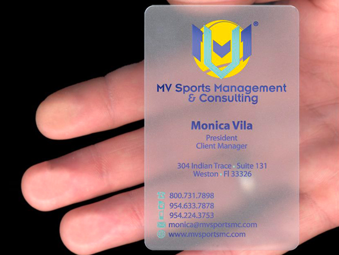
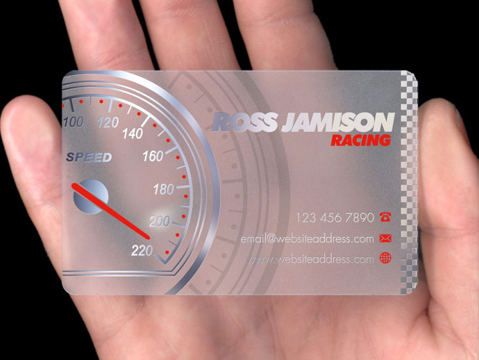
/0 Comments/in Business, Graphic Design, Printing/by Bruce QuirozThe design industry is an ever changing ecosystem of innovative and creative ideas. In an environment that is so constantly in flux its essential to stand out. At Elemental Studios we understand that first impressions are critical and the need to make an impact as soon as you meet a new potential client is extremely important. The first thing we tend to provide a new interested clients is our business cards, so why hand then something everyone else has? Just as the graphic design industry evolves so does the printing industry. Today you can find printing techniques that were unavailable prior or just extremely expensive.
Our design team is seasoned in creating options that incorporate the latest in printing techniques, such as Clear (Acrylic) Business Cards: (Some images provided by www.plasmadesign.co.uk)
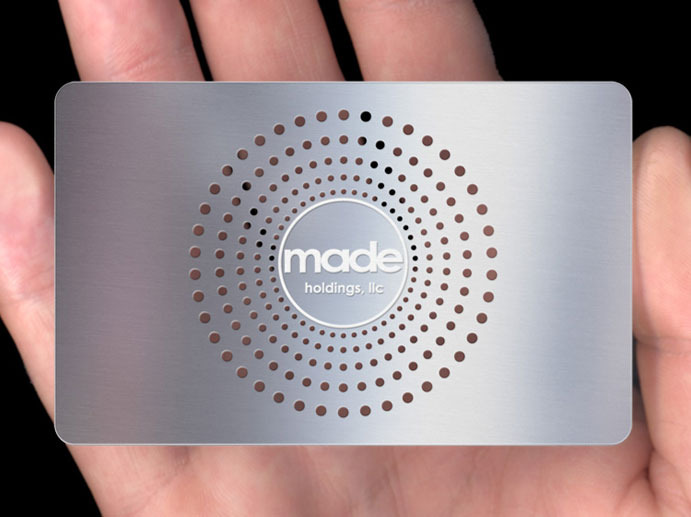
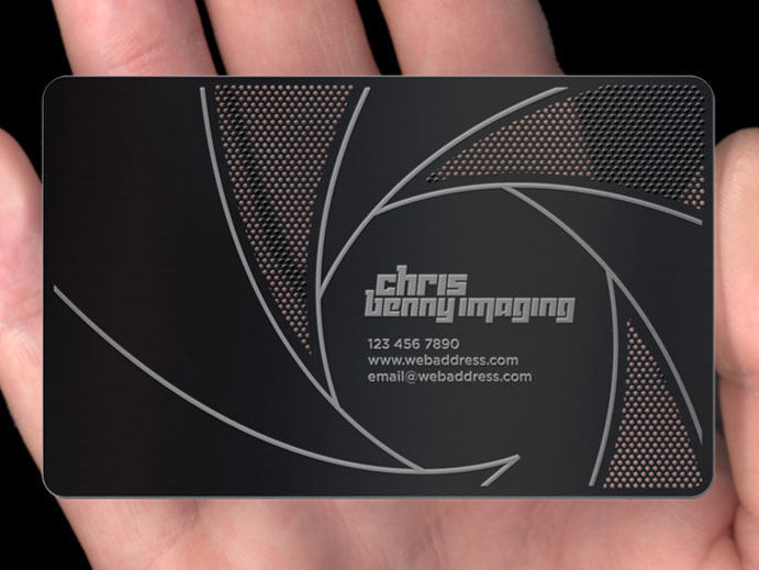
Or how about these metal cards: (Some images provided by www.plasmadesign.co.uk)
Other incredible new printing options include wooden cards, leather cards, turf cards (Actual TURF!) and various other unique materials. Call our studio today and speak with a design coordinator to find out what options would be best for your business and start creating and impact today.
Design Around the Lines: Barcodes Don’t Have to Be Boring
/0 Comments/in Graphic Design/by Bruce QuirozMONDAY 12.23.2013 , POSTED BY BENJAMIN STARR
We love the idea of taking overlooked design elements and making them beautiful. The barcode is a good example of this. It’s on nearly everything we buy – from your latest iPad purchase to a Snickers bar at the market – just a bunch of lines and numbers with very little (if any) thought put in to how it looks. We’ve covered Steve Simpson’s remixes before, and now we’ve run across D-Barcode, a Japanese design firm that’s been steadily revamping this oft overlooked element.
SEE ALSO STEVE SIMPSON REMIXES THE UBIQUITOUS BARCODE
The thing about barcodes is this: you only need a very small area to actually read the information. What surrounds this small patch of data, is hardly important and ripe for creative artwork that plays upon the barcodes linear form. D-Barcode has turned those strips of black into streaks of falling rain, a placemat on the table, the walls of a fairytale castle, and even a cascading waterfall. As you can probably tell, the numbers are only there for visual input should the barcode become unreadable – so those elements can easily be moved or even have the font changed. We’d love to see this on more products – at least it would add something interesting to look at when eating our breakfast cereal. Be sure to check out more at D-Barcode, and see Steve Simpson’s guidelines for how to design your own.


